Dashboard overview
A tour of the dashboard's KPI cards and widgets, and how to filter them by account or date.
The dashboard is a one-screen view of how you're trading: your key numbers up top, then a fixed set of widgets below covering P&L, risk, and habits. Nothing to configure, everyone gets the same layout.
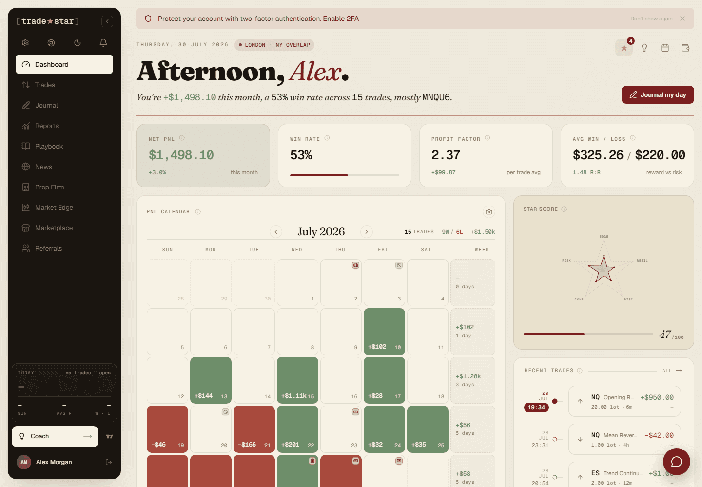
The KPI row
Across the top: total P&L, win rate, profit factor, and average win/loss ratio, updating automatically as you log or sync trades. Use the account and date filters above them to narrow the view to one account, a date range, or a group of accounts.
The widgets below
- Equity curve — cumulative P&L over time.
- P&L calendar — a monthly heatmap, one colour-coded cell per trading day.
- Star Score — your Edge/Risk/Discipline score (see "How is my Star Score calculated?").
- Recent trades — your latest trades at a glance.
- Daily P&L bar chart, day of week and time of day breakdowns.
- Top instruments and strategy performance — P&L and win rate sliced by symbol or playbook.
- Win/loss distribution and drawdown chart.
- Open positions — anything currently open across your synced accounts.
AI Trading Coach
A card on the dashboard summarises your recent patterns, strengths, and the leak costing you the most. It's the same coach behind the full AI chat, this is just its dashboard-level headline.
On mobile
The grid collapses to a single column, and the sidebar becomes a bottom tab bar. Same widgets, same data, one column instead of three.