Reading an Edge Lab result
What the verdict means, why win rate and target hit rate are shown side by side, and how to tell a real edge from the best of ten thousand guesses.
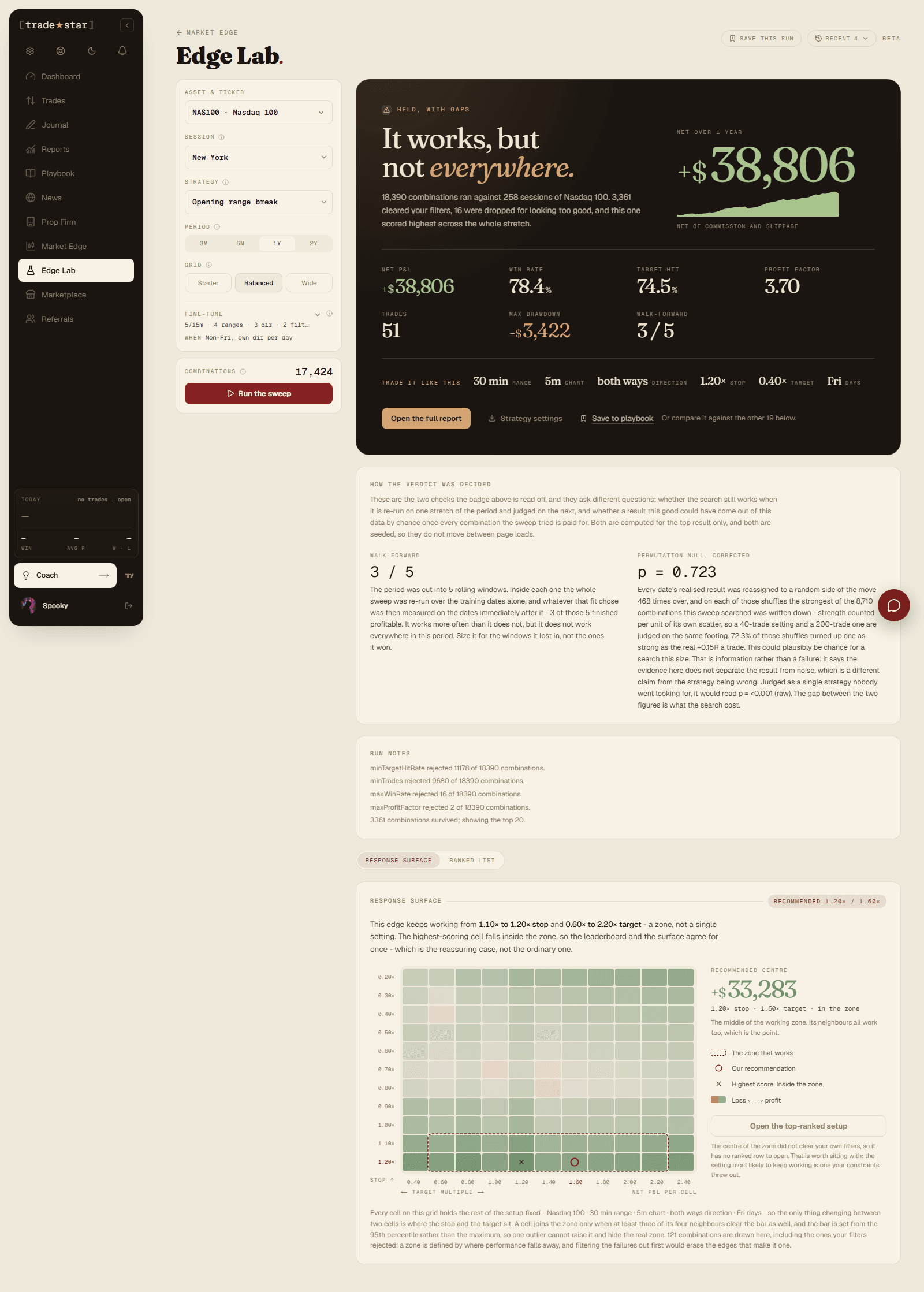
A sweep returns an answer first and a table second. The answer is one verdict, eight numbers, the settings you would actually trade, and two checks that exist to argue with all of it.
Win rate and target hit rate
These sit next to each other on purpose and you should read them as a pair.
Win rate is how often the trade closed green. Target hit is how often it actually reached the target you set. On a near target they move together. On a far target with a tight stop they come apart completely, because most of the green closes are positions flattened at the session bell rather than targets reached.
The note under Target hit gives you the full exit mix: how many reached the target, how many stopped out, how many closed at breakeven, and how many were flattened at the close. If those two percentages are far apart, the strategy is not doing what its target implies.
If you are transcribing this to a chart
A win rate quoted next to a 2.00x target reads as "the target hits this often". It does not. Check the target hit rate before you put the settings on an indicator, or the chart will disagree with the report and the chart will be right.
The verdict, and the two checks behind it
The badge is read off two checks. Neither is a score and neither is optional.
Walk-forward cuts the period into five rolling windows. Inside each one it re-runs the entire search over the training dates alone, takes whatever that fit chose, and measures that on the dates immediately after. It is a verdict on the search rather than on the row above it, which is why the winning parameters can differ from window to window. Three of five means it worked more often than not and did not work everywhere.
Permutation null, corrected asks whether a result this good could fall out of this data by chance. Each date's realised result is reassigned to a random side of the move, hundreds of times, and the strongest cell anywhere in the grid is recorded each time. The p-value you see is corrected for how many combinations the sweep searched.
Why the corrected p is so much larger than the raw one
Both figures are printed. Judged as a single strategy nobody went looking for, a result might read p = 0.001. Judged as the best of eighteen thousand attempts, the same result might read 0.7. The gap between them is what the search cost you. The corrected number is the honest one, and it is the one the badge uses.
A high corrected p is not a failure. It says the evidence does not separate this result from noise at this search size, which is a different claim from the strategy being wrong. It usually means you need more data or a narrower search, not a different strategy.
The surface and the list
The default view is the response surface, a grid of stop against target with every other setting pinned. Colour is profit. What you are looking for is a zone, a patch of neighbouring settings that all work, rather than one bright cell surrounded by losses. A single good cell next to bad ones is a coincidence with a good haircut. A cell only joins the zone when at least three of its four neighbours clear the bar too.
The ranked list is the same run as a table, for comparing rows. Only the top row carries a verdict, because both checks are computed for it alone. Every other row reads "not assessed" rather than passed, which is deliberate: a dash there would be read as fine.
Run notes sit above both and are worth reading. They state how many combinations each filter rejected, how many survived, and, importantly, when the run quietly answered a narrower question than you asked, such as a quartile size split that could not be placed and ran without a size condition.
Saving and reusing a run
Save this run stores the request that produced it, not just the figures, so re-opening it reproduces the result rather than approximating it. The library card shows the window its numbers describe and when it was last run, and marks the figures as stale if a later run did not replace them.
Strategy settings downloads a transcription sheet: every setting the result was measured with, including the session, the flatten time and the period. Use that rather than copying numbers off the screen.
The flatten rule travels with it
Edge Lab flattens five minutes before the session close and holds nothing overnight. If your indicator holds longer, it is running a different exit rule and will not agree with the report. The sheet prints the flatten time for exactly this reason.
What to be suspicious of
- A per-weekday winner. Trading a different direction each weekday is powerful and heavily fitted. The panel states how many days were traded out of how many were considered. Those are free choices made on the data being measured.
- A very high win rate. Anything above 85% is rejected outright by the overfit guard, and anything approaching it deserves a look at the trade count.
- A small trade count. Fifty trades over a year is a Friday-only strategy on fifty Fridays. It can still be real. It is not much evidence.
- A big gap between win rate and target hit rate. See above.
Want to pull results programmatically? See the Edge API.
Edge Lab
Sweep every version of a strategy against years of real sessions, rank what survives your own filters, and find out whether it held up or just fitted the data.
Marketplace
One-time purchases, strategy guides, indicators, and code, buy once and keep it, plus what free and logged-out visitors see.